
Bloombox
Redesigning bloombox’s website

The Client
Bloombox
Bloombox is a high end personalized flower service. From centerpieces to bouquets to flower walls they do it all. Our design team had the challenge of redesigning their main e-commerce website. Below you will be able to see the process from start to finish.
The Problem and the Challenge
Bloombox’s original website lacked organization and did not follow an ordering process to make it easy on a new first time visitor of the website.
Our design team had to dissect Bloombox’s original website to see where the flaws were. In the original website there was a lack of understanding what the steps are to purchase flowers. Any new user that would go on the website, did not have a navigation of where to start. Below you will be able to see the original websites “homepage” and understand where I am coming from.

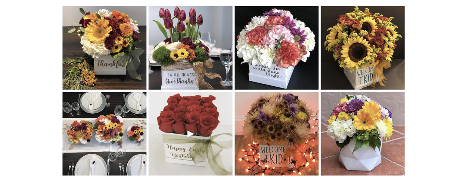
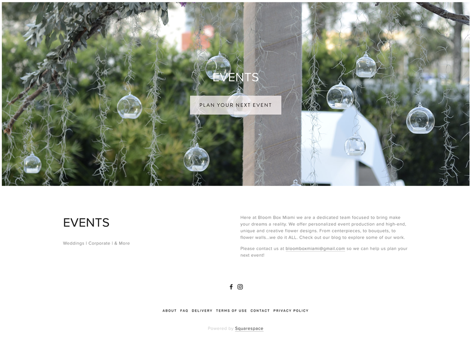
Bloombox original website homepage
The Team
Our team was made up of myself Paula Barreto (the photographer), Lazaro Viera, Daniela Gonzalez-Moncayo, Kelly Gedvillas, Cristabel Uribe, Isaiah Barrett and Meishara Jaghai. In order to put our prototype together within limited timeframe it was important to get organized. So we defined our roles into makers, stitcher, writer, asset collectors and interviewer. We went through several steps of ideation and sketching in which we all voted quietly and anonymously by using dotes. This process allowed us to find the answers we needed quickly.
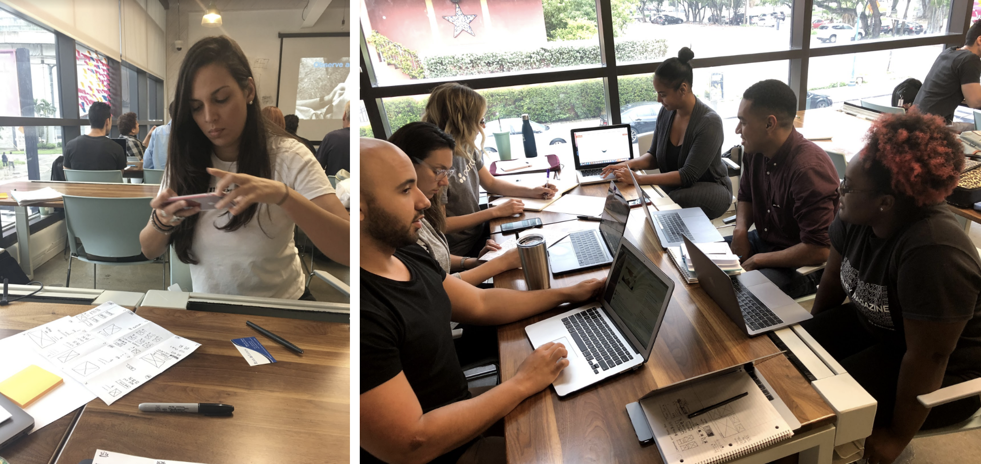
The Team
The Agenda
To solve Bloombox’s problem we decided to utilize the Design Sprint process which is a 5 day process for solving problems and testing new ideas invented at Google by Jake Knapp.
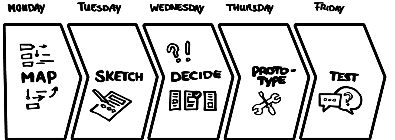
Ideation Phases
We used the Design Thinking Methodology to empathize, define, ideate, prototype and test our progress.

After extensively reviewing the original website, we went into the ideation phase of creating a storyboard that will help get a better understanding of the structure for the new site will look like. Once we got that done, we went onto create a features page that went over the new features we want the new redesigned website to have. The user flow then helped us determine the process/steps a new user would go to navigate the website. And finally we sketched out a three step solution that would make the user experience seamless and reduce the amount of steps it takes to purchase flowers.
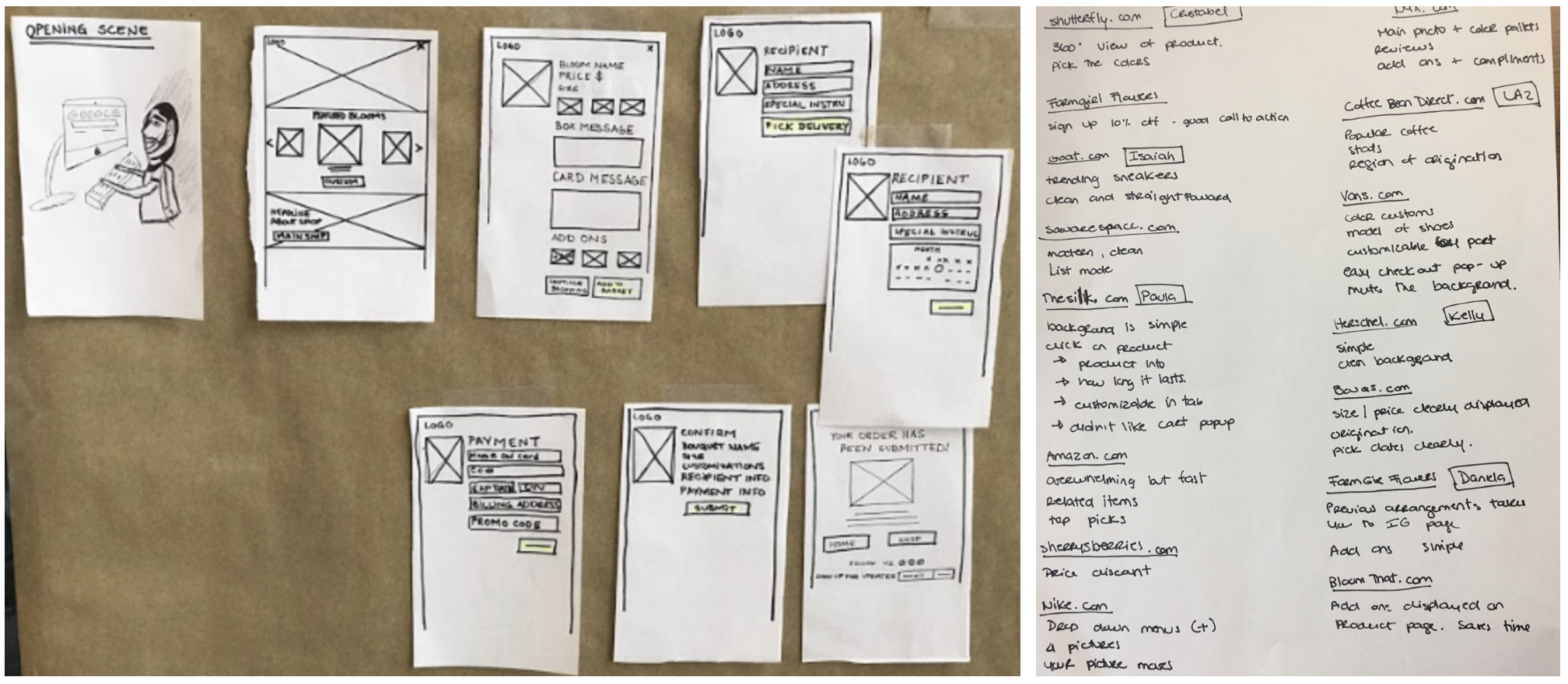
Storyboard— Features Analysis
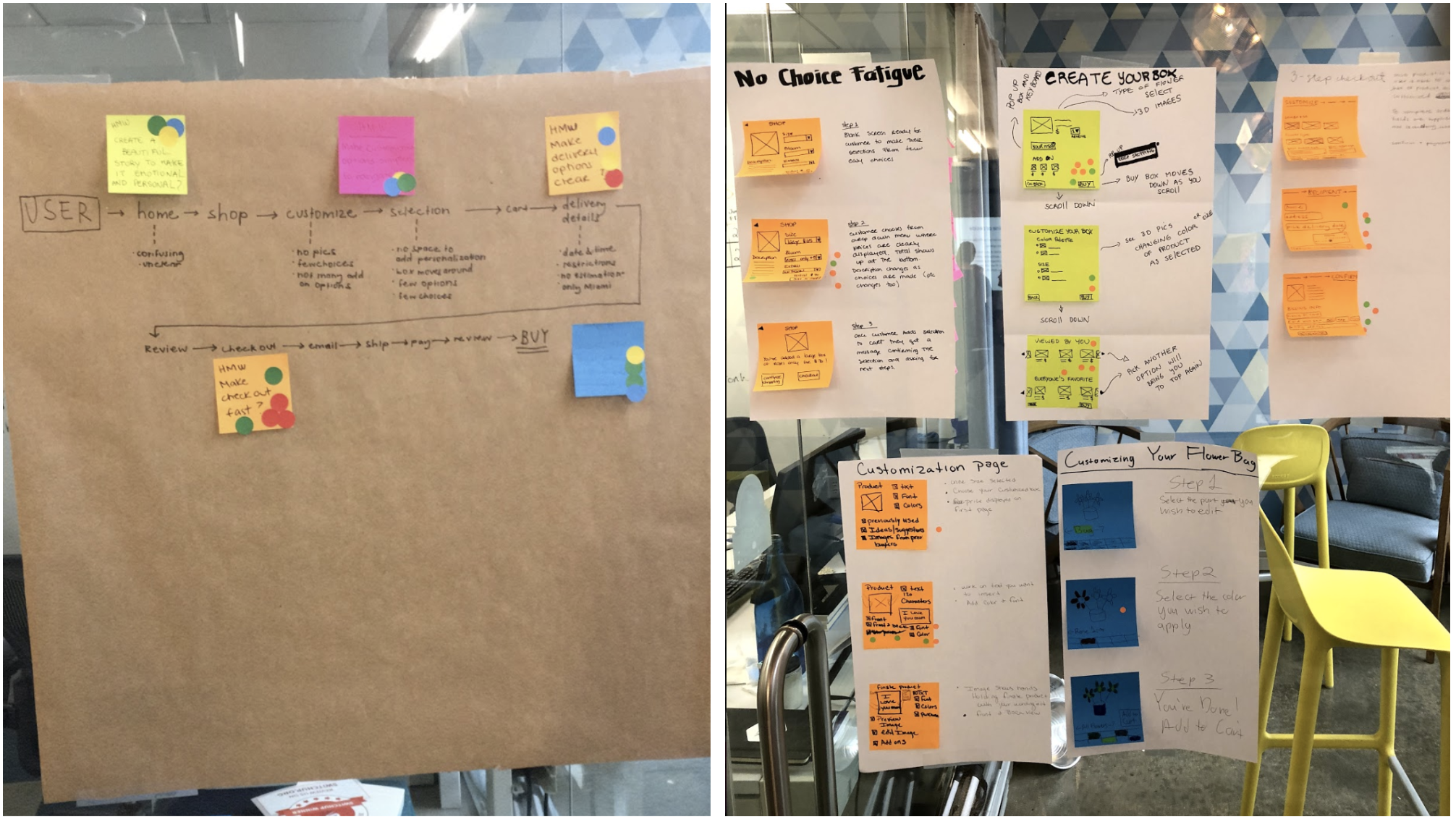
Bloombox Userflow —User Research
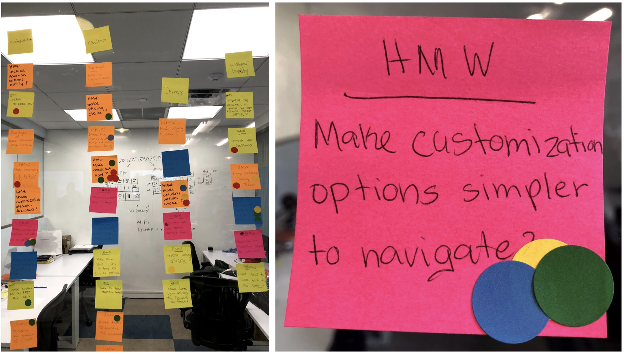
How Might We
Conclusion
The completion of our final redesign of the Bloombox main website, we learned the importance of making a seamless User Experience. That without one a user would get confused and be turned off from using the website to purchase flowers. If you are able to make a website that in the first few seconds shows the user how to navigate the website, and in this case tell you how to purchase flowers, this could potentially increase sales and user retention.

Mid-fidelity wireframe
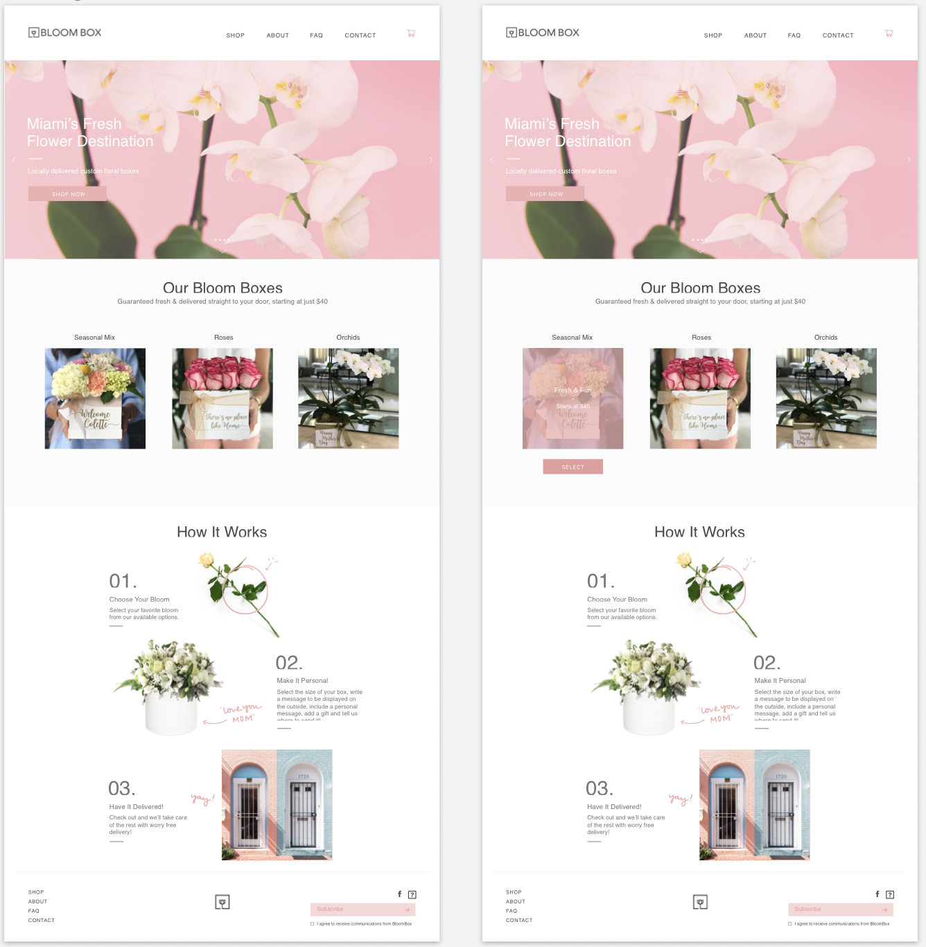
Home page final design
Thank you note
The conclusion of this project wouldn’t be possible without the collaboration and hard work of all people involved in this process. The writing of this article was a collaboration between Isaiah Barrett and myself Paula Barreto.
