


Written by: Paula Barreto • 5 min read
The Challenge
This project aims to design an online grocery shopping app for a fictional client by practicing the principles of Interaction Design. Initial research was done by DesignLab. However to validate the idea and to better understand the user I carried my own individual research with potential users to create a real life persona.
Role
UX/UI Design & Interaction Designer.
Tools
Sketch, InVision & Adobe XD.
Prompt
Good Market is a (fictitious) medium scale grocery franchise based in the United States. Although their customer satisfaction ratings have remained relatively constant over the last 4 years, their market share has been decreasing by 8% each year. If they continue at this rate for another year or two, they’ll be forced to shut their doors.
Through some market and user research they’ve determined that this decline is most likely due to the increase in online grocery ordering & delivery products, like Fresh Direct and Instacart.
Many customers prefer these products to shop in store because they’re faster, easier and more convenient — customers can shop from their desks, homes, or in line at the coffee shop.
Good Market believes that if they allow their customers to shop and buy their products online, they can expand their customer base and market share. They plan to design and release a pilot program in New York and San Francisco, iterate based on what they learn and then expand the product to other cities around the country.
Persona
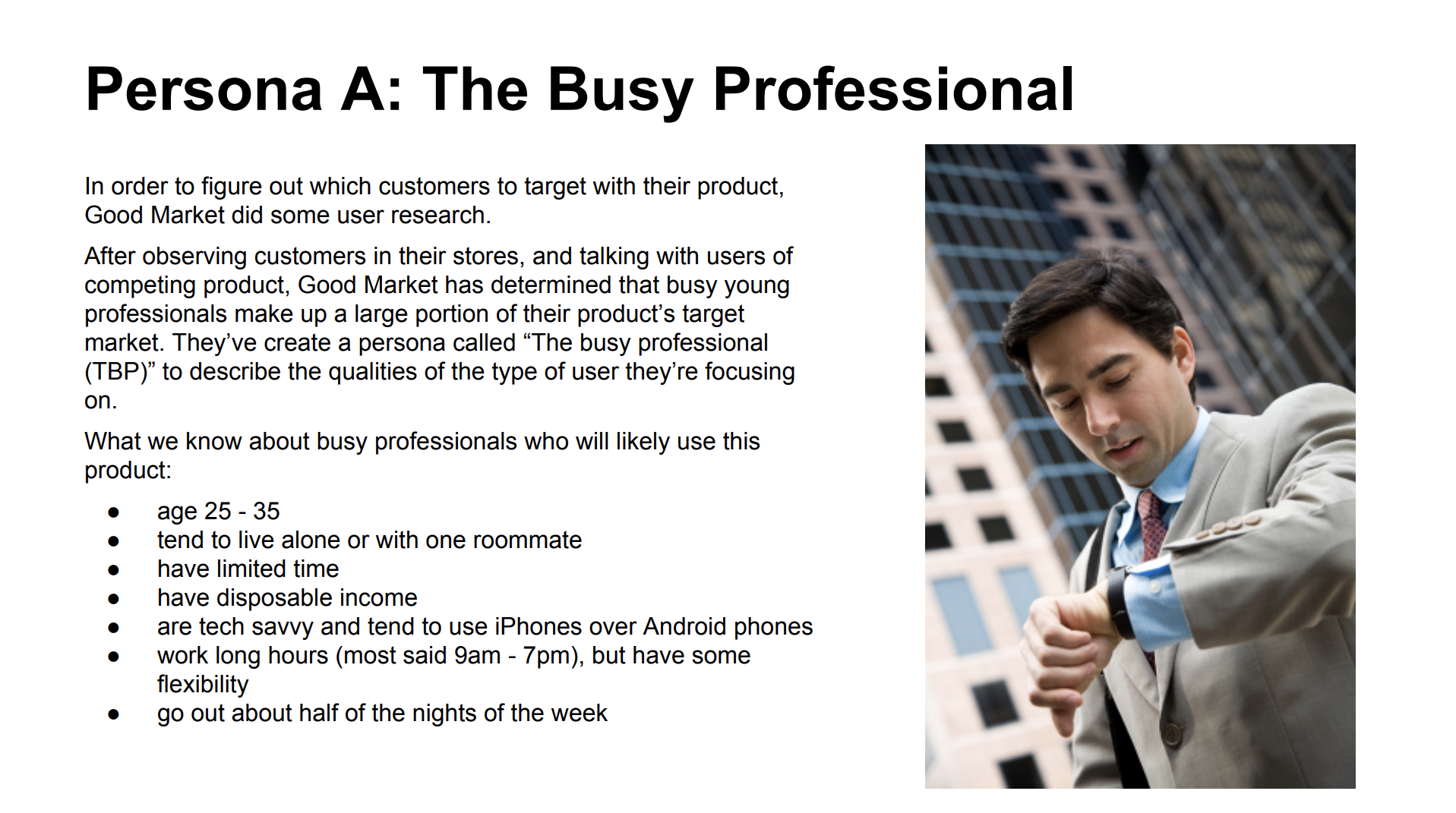
The Busy Professional was created by DesignLab researchers.

As part of my research I spoke with Kayla, Felipe and Andreza who are in the target market, and are potential users for a grocery shopping app.
Business Goals
I began this design process by listing, at a high level, the client's business goals, and the goals of their users.
What is the expected business goals for the product?
What are the user's goals?
How do the business and user goals align?

Vision Statement
GoodMarket is a grocery shopping tool that helps customers quickly and easily shop and purchase groceries online, and then have them delivered promptly at little to no cost
Competitive Analysis
After analyzing the business and user goals it was time to look at the competition. This analysis helped me understand what solutions already exist, what works well and what can be improved. With this information in hands I can begin to design a product that is superior to existing products.

Usability Competitive Analysis Report
What is Usability?
Keeping in mind usability principles and heuristics I took a look at the competition to evaluate the usability of their products. The goal of this exercise was to identify examples of the competing product breaking these principles to the user’s disadvantage, make suggestions about how they could be redesigned for better usability then to create a report that follows the heuristic guidelines and outlines both positive and negative aspects of the product interface and service offering.
Instacart

Instacart Usability Competitive Analysis
Fresh Direct
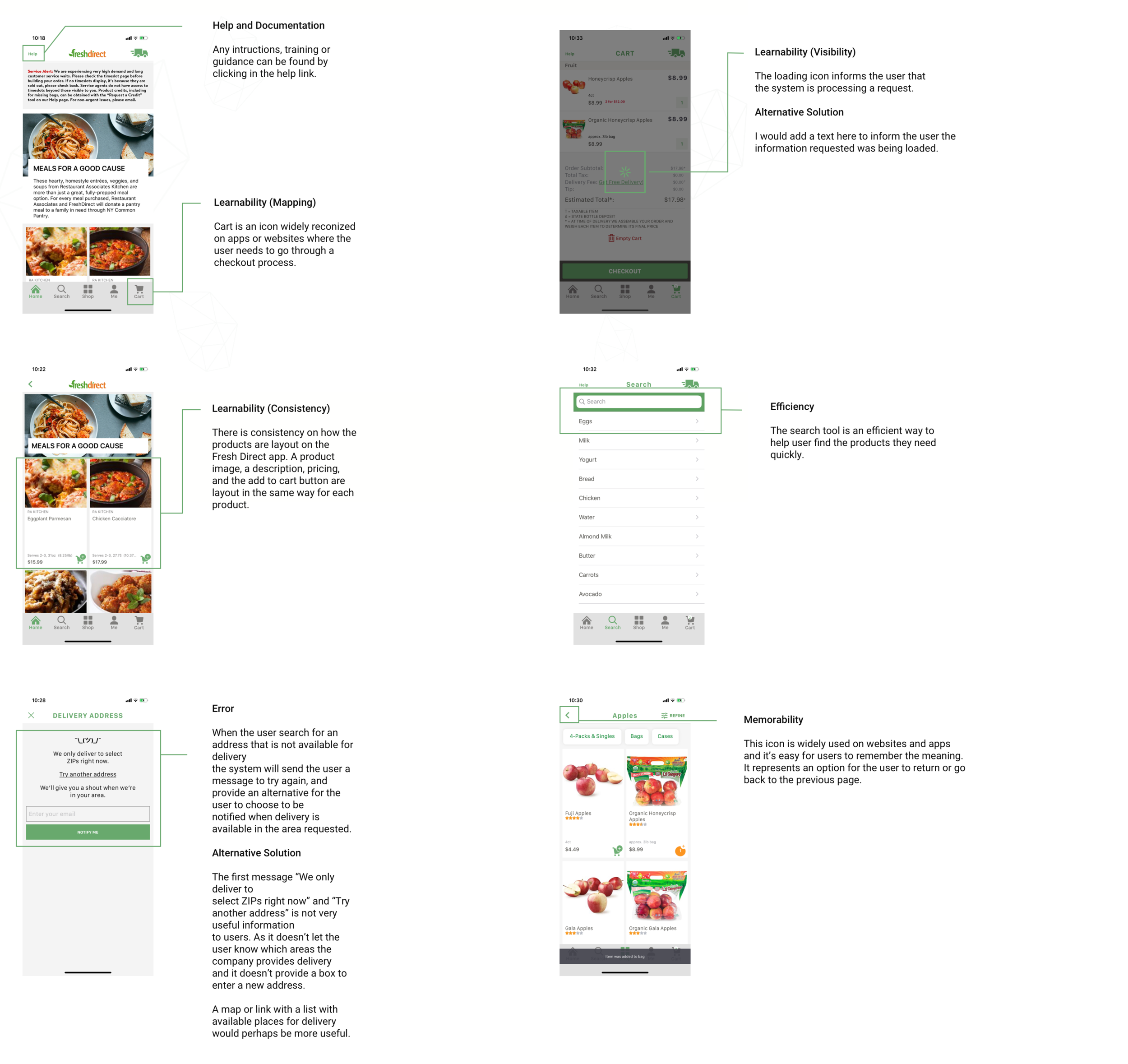
Fresh Direct Usability Competitive Analysis
Walmart
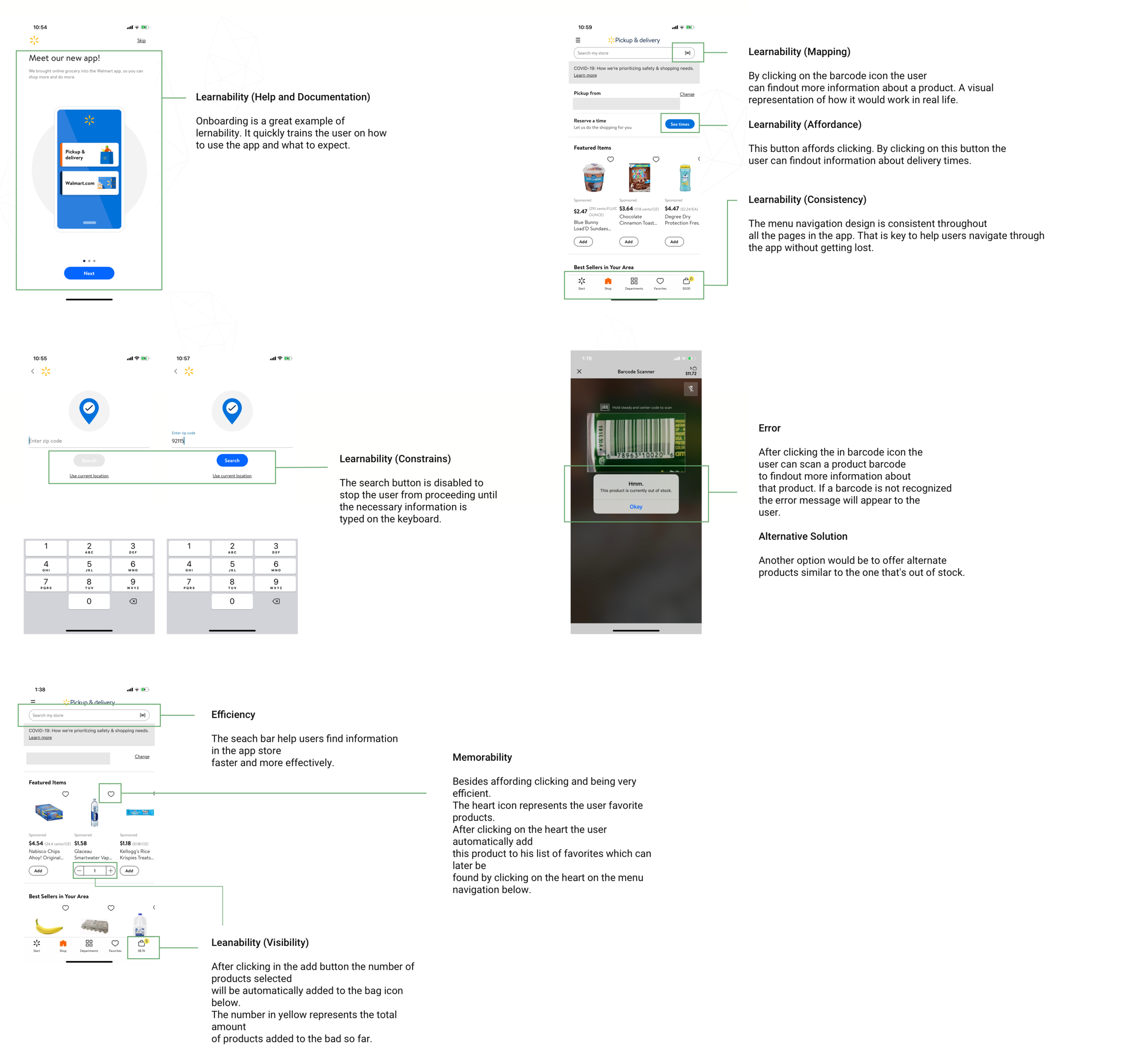
Walmart Usability Competitive Analysis
Information Architecture
Card Sorting
To make a more informed decision about how the information should be organized on the app I grabbed twenty items from the GoodMarket inventory list and identified three participants that are in the target market of GoodMarket to do a Cart Sorting exercise. The results and key takeaways from this exercise you can see below.
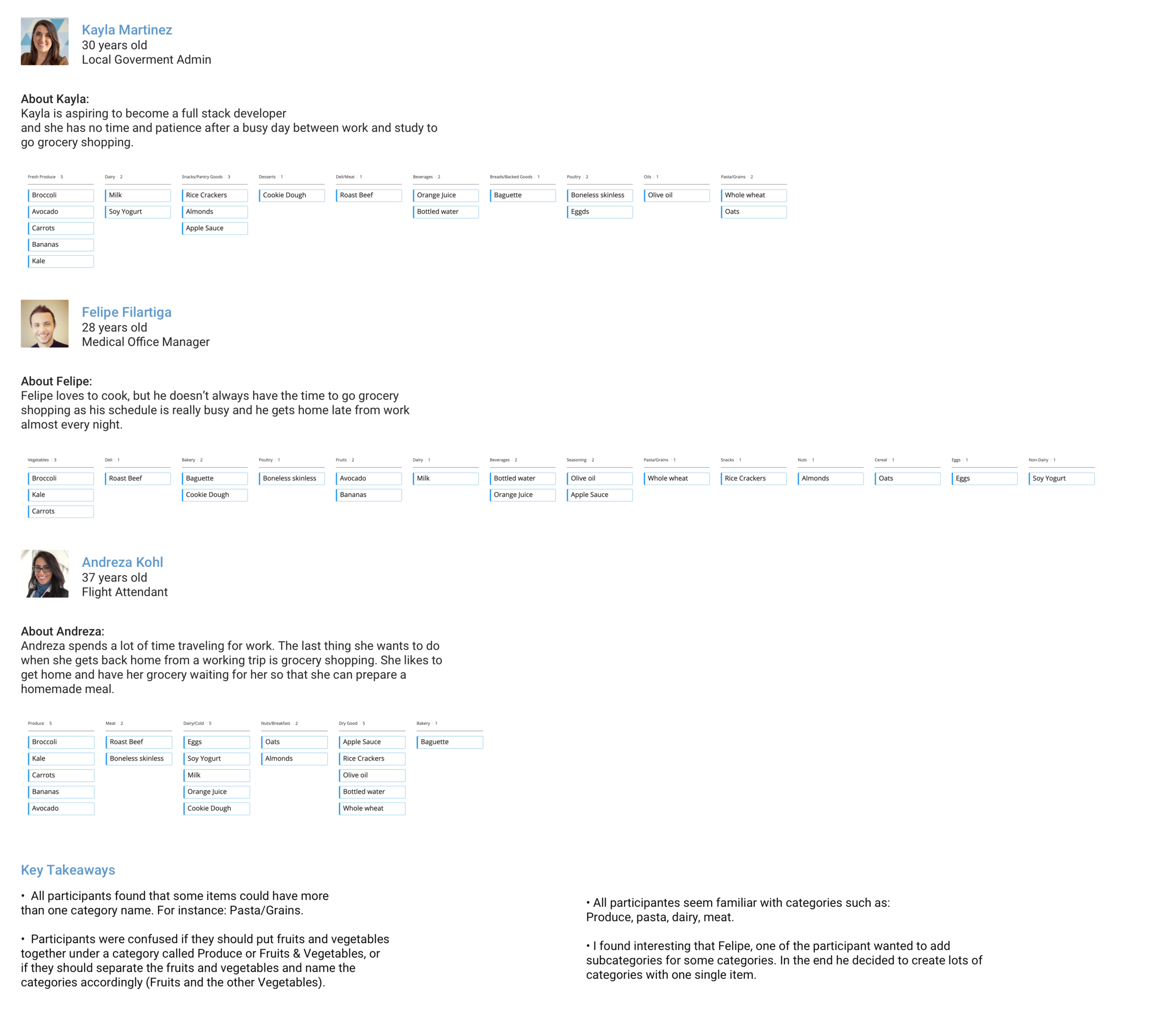
This card sorting exercise was done with my three personas: Kayla, Felipe and Andreza.
Sitemap
After organizing the content into categories. I created a sitemap to show the relationship between the content on the app.

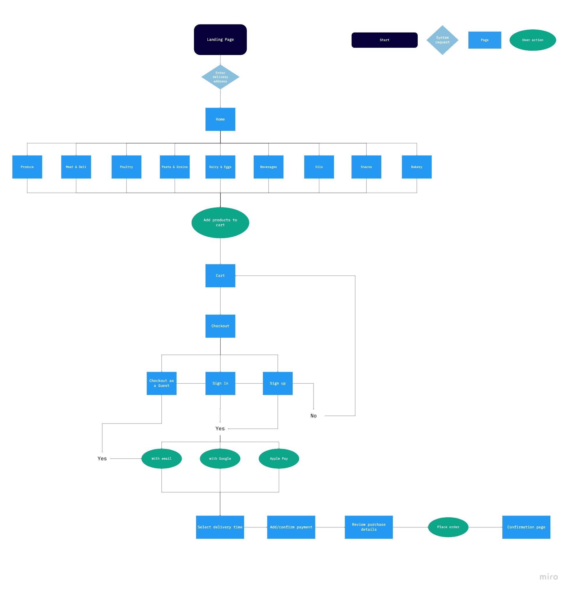
User flow
A user flow is a map of how users can move through the product to accomplish their goals. It outlines all possible scenarios, options, errors, dependencies, and outcomes. It also takes into account persona needs and context.
To identify the paths that a user would take through the app to complete each task this wireframe was created to illustrate how a user could complete each of the following tasks.
Wireframes

People don’t want to waste time shopping online to find out later in the process that the products on their cart can’t be delivered to their location. This is why we start this experience by verifying the users location and not allowing him to waste precious moments.

Now that the user has verified the user’s location he can start adding products to the cart right away. Products can be added to the cart in several different ways. For instance, users can add products from the initial shopping page, from the product detail page and also from the cart itself.
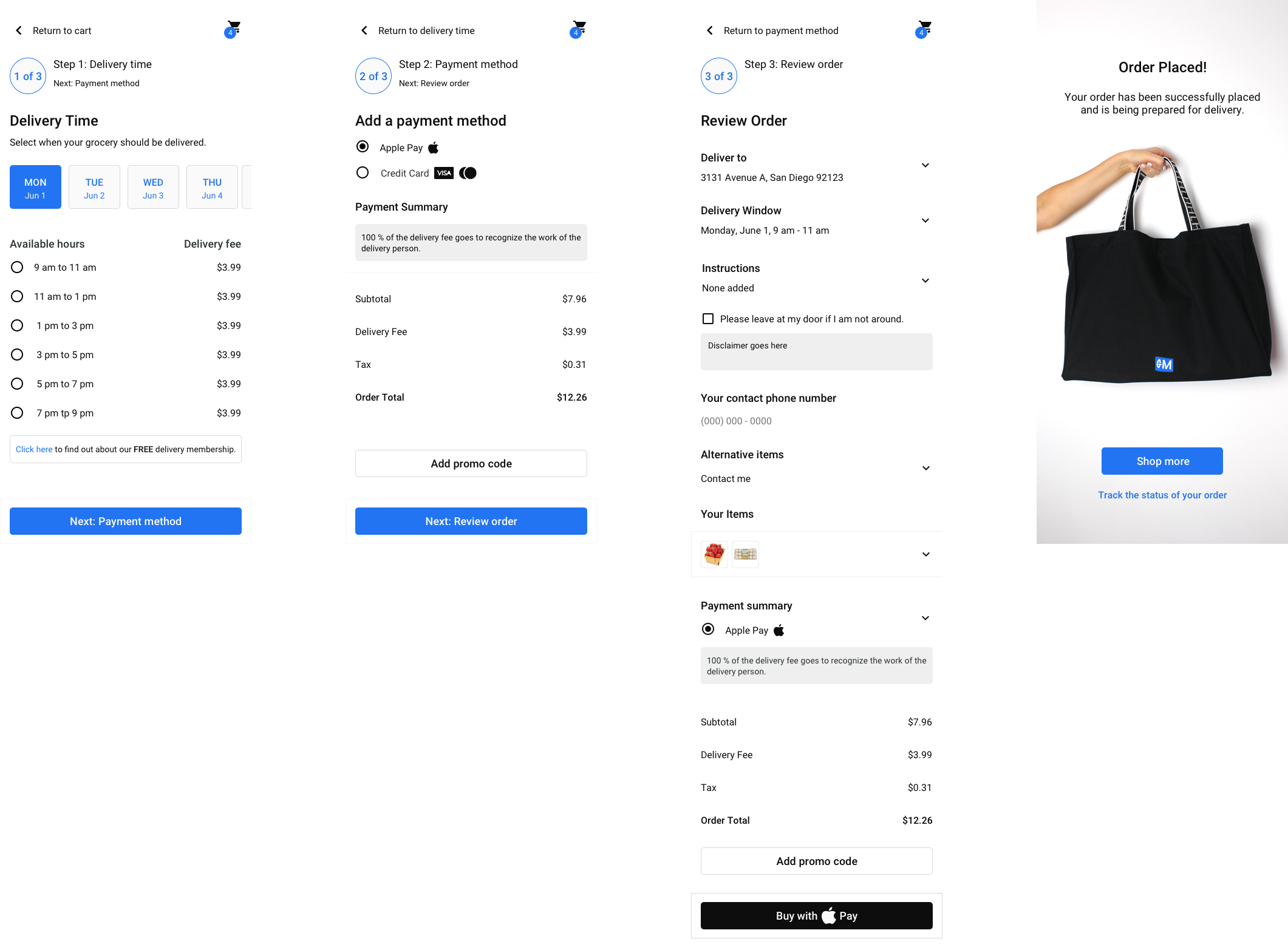
As the user you can decide to checkout as a guest, sign in or sign up. Then your checkout process will include selecting the delivery date and time, payment method and a final review page before completing the payment. After adding and confirming this information the user is presented with a confirmation page and able to go back and shop more or track the status of his order.
Prototyping
Conclusion
So there you have it! In the course of 4 weeks, I walked through the Interaction Design process by designing a grocery shopping app, GoodMarket. I took a set of business requirements and user goals, and turned that into a set of core user flows, sitemaps, and wireframes — all keeping usability and heuristics in mind. If I was to proceed with this challenge, I would move on to the Testing phase. Hopefully, you enjoyed my work.
If you would like to work with me in a future or current project please feel free to contact me or connect with me through LinkedIn.